Year
2015
Area
420 sq. ft.
Status
Completed
Client
Sassy Teaspoon / Racheal Goenka
Design Team
Rooshad Shroff, Dhruvin Shah, Aarushi Bafna, Sneha Mathreja
Photo Credit
Sebastian Zachariah
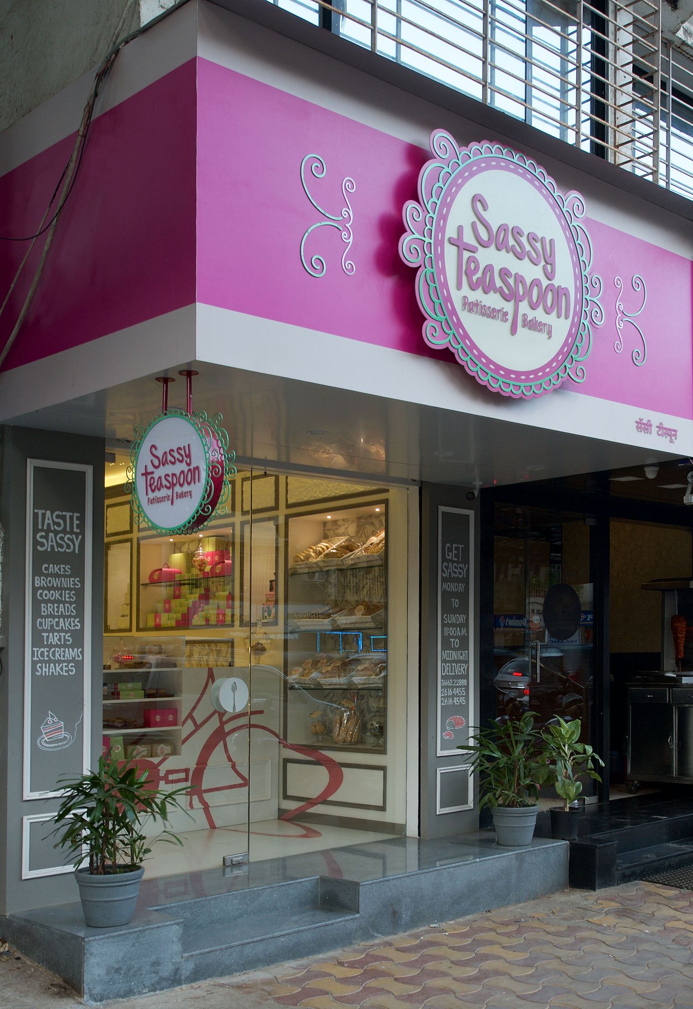
An offshoot of The Sassy Spoon resto-bars, The Sassy Teaspoon in Juhu, Mumbai was the first of a chain of patisseries across the city. We were brought on board to create a strong visual identity for the brand, which could then be replicated at their other outlets.
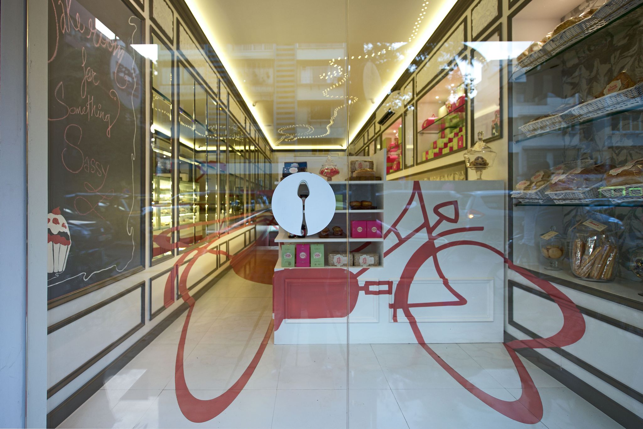
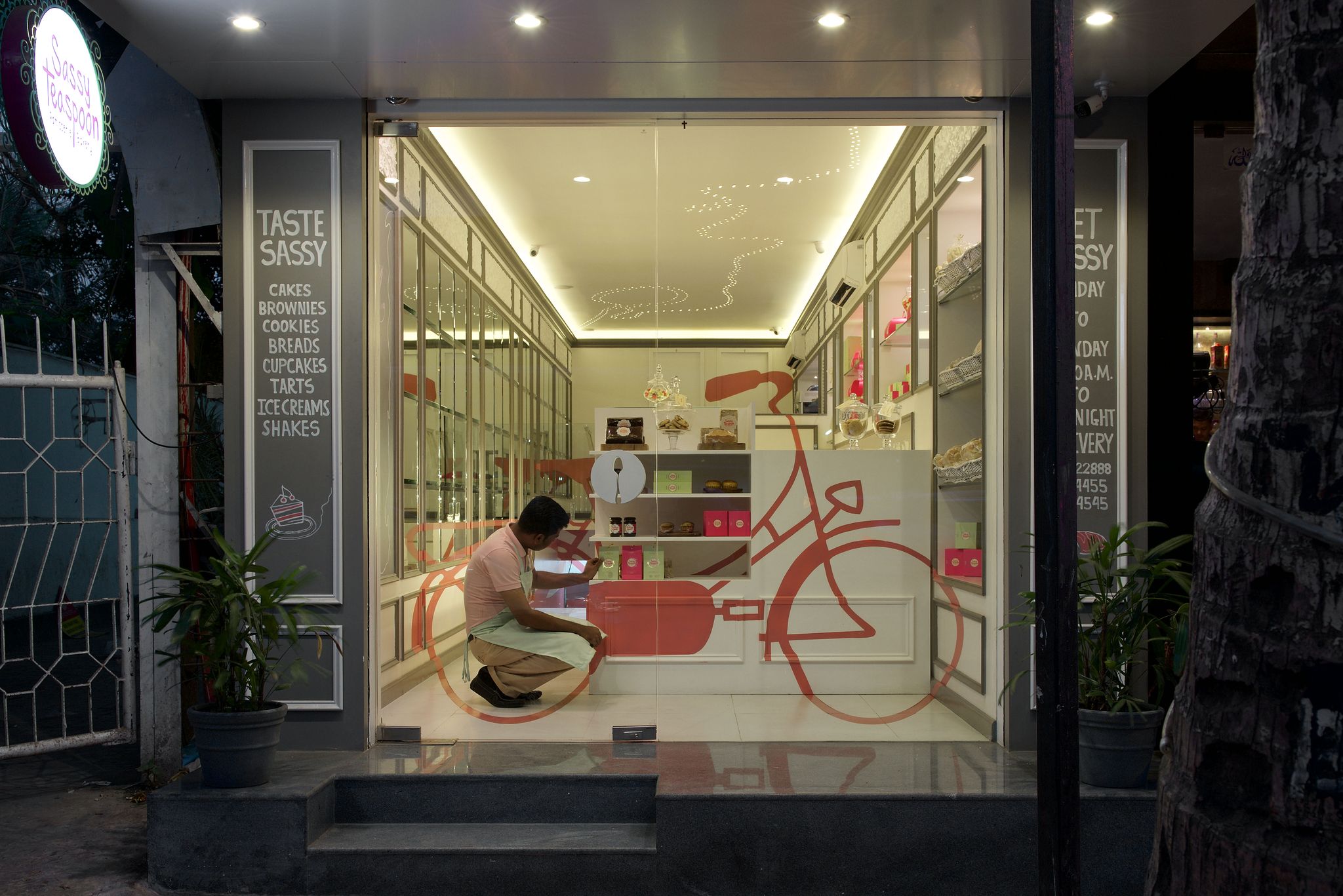
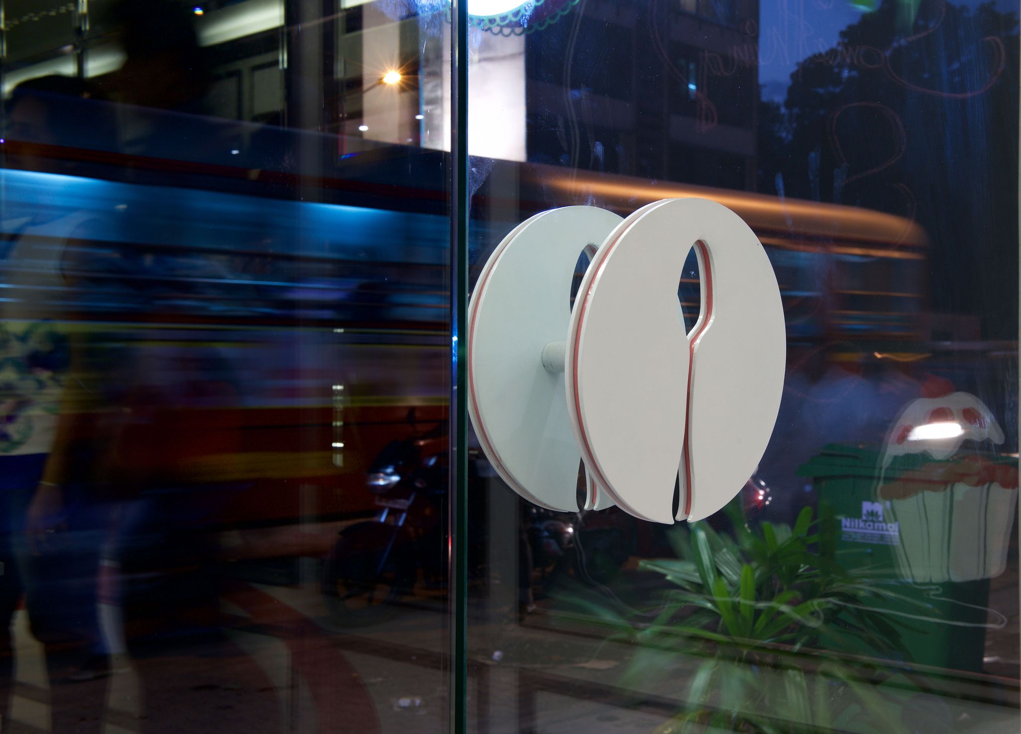
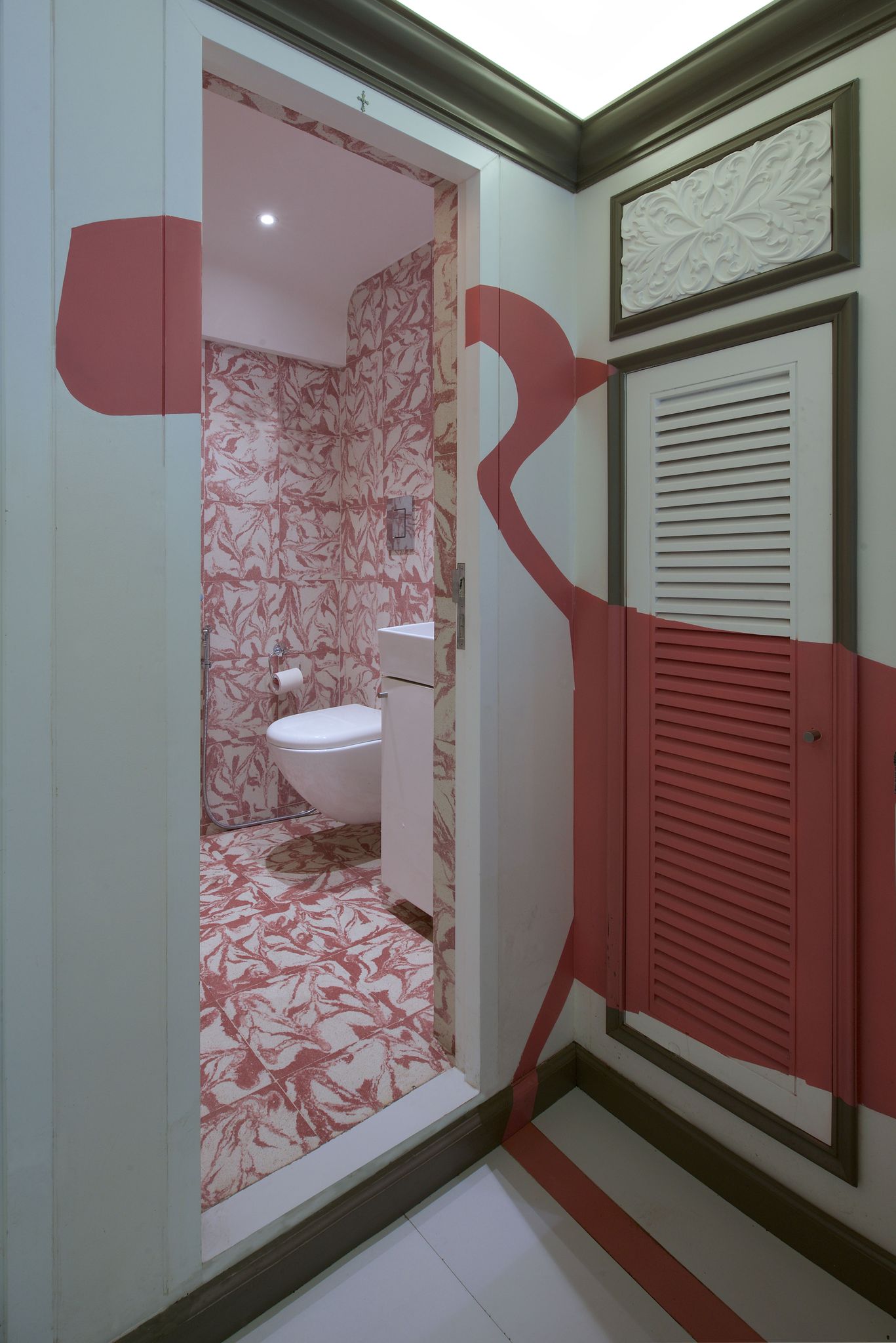
Chef and owner Rachel Goenka was very keen on a French patisserie look and feel, incorporating a strong use of pink, their signature corporate colour. We met this brief with some trepidation, which necessitated a study of the various quirky elements of the parent company, and the whimsical nature of one in particular stood out -- the pink bicycle parked outside of all their restaurants.
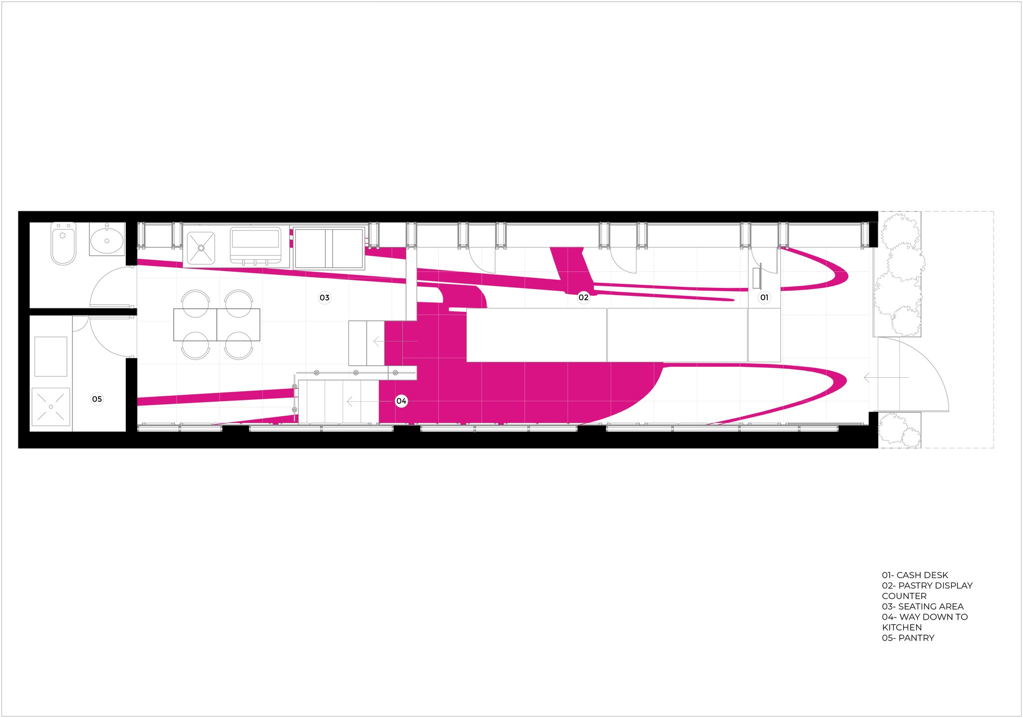
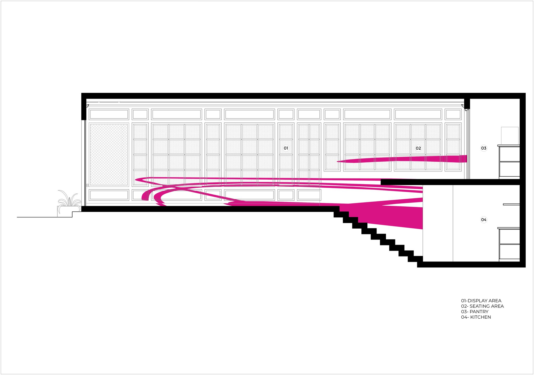
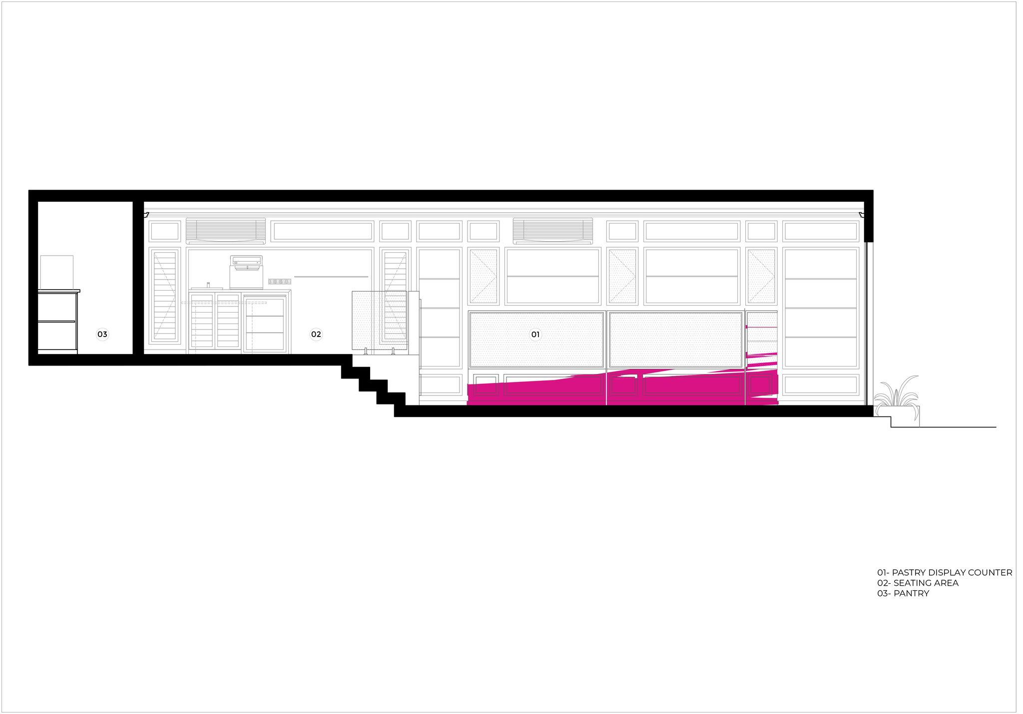
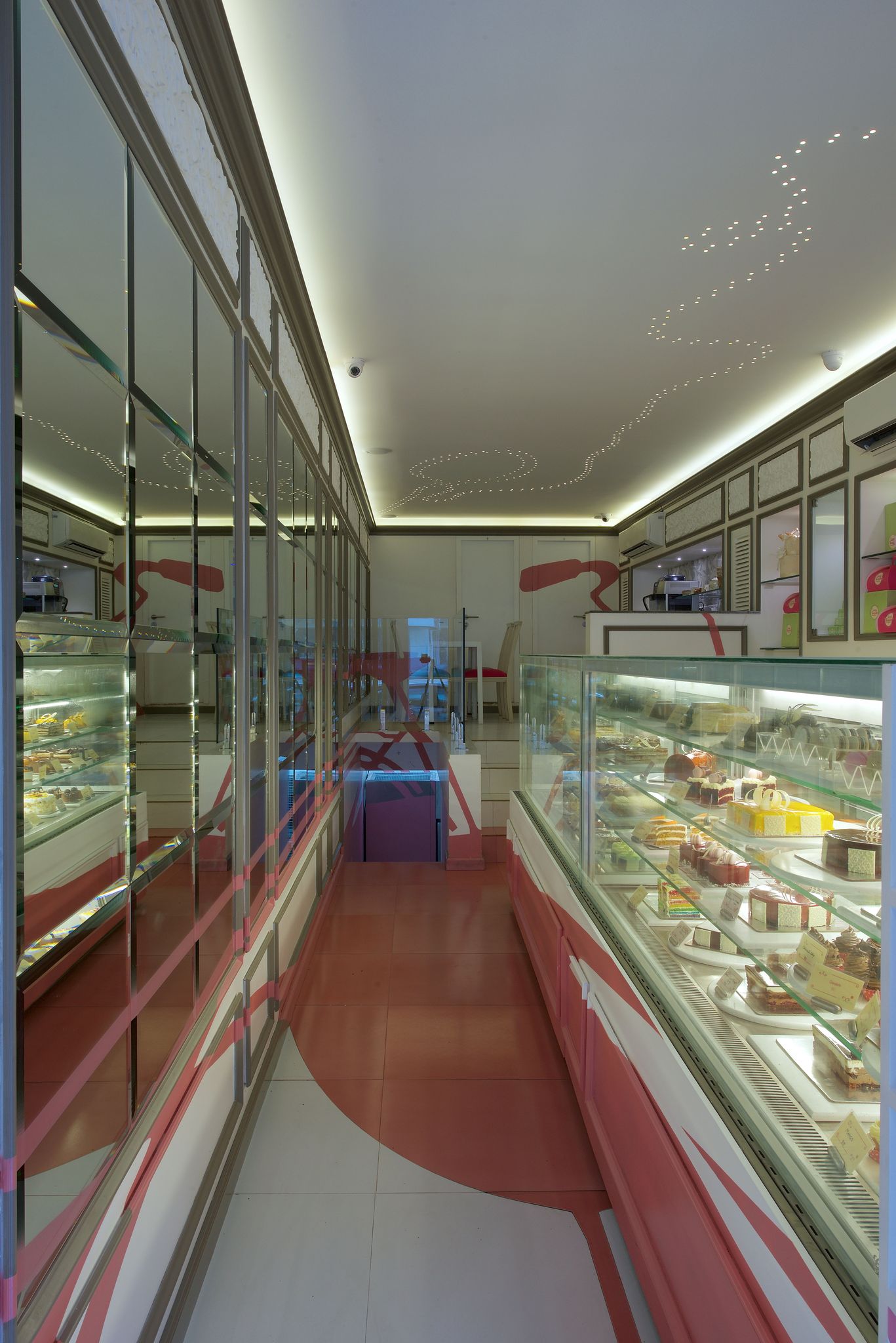
Already a strong visual for the Sassy brand, we honed in on the bicycle as the perfect accent for the patisserie, and decided to execute our vision by way of an anamorphic projection -- an image that is recognisable only from a specific vantage point. As such, the bicycle imagery would appear as a cohesive whole only from the exterior of the store and at a particular angle, dissipating from view as one approaches and enters.
While this was something we were keen to pursue from a conceptual perspective, it was to prove the most technically challenging project we have undertaken to date. The translation from drawing to execution had not the slightest margin for error; all the elements would have to align perfectly in order to form the complete image from a singular vantage point outside.
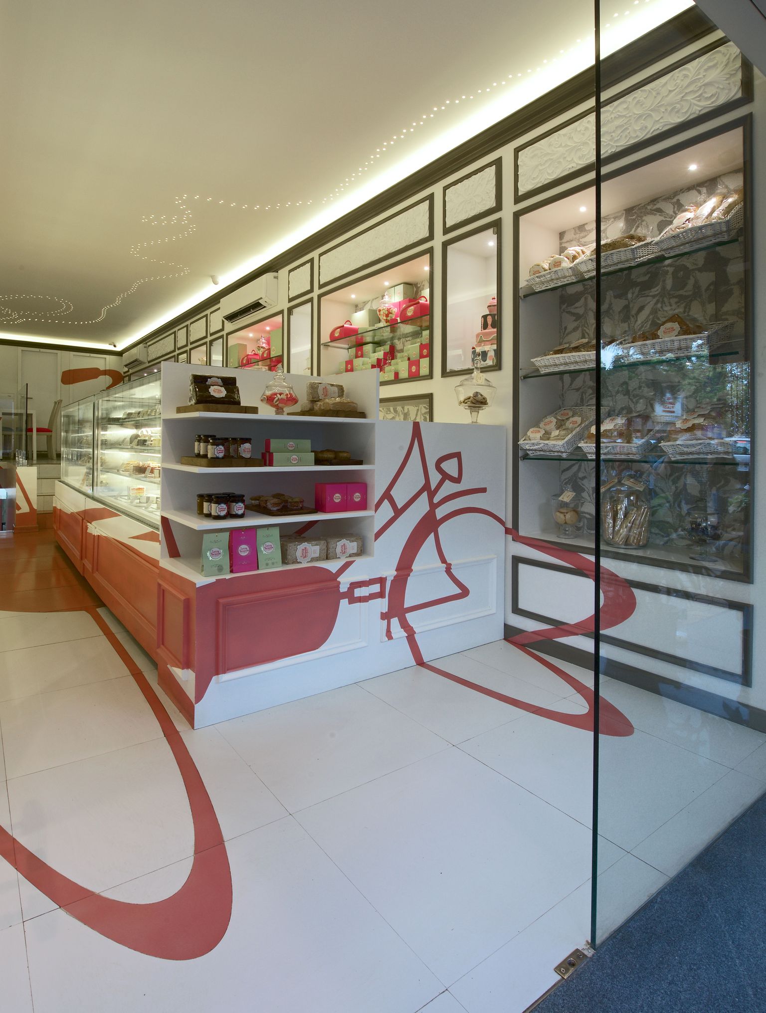
Once the technique of execution was established, our focus shifted to individual materials; spread over floor, wall and ceiling and with several to be prepared off-site, it would take meticulous planning to ensure each one was tailored to an exacting requirement. The white floor tiles had sections laser-cut, dyed pink and were then subsequently baked; a mirrored wall had to have part of the mercury etched off the back in order to paint segments without disturbing the glass finish. Maintaining this continuity of colour to strike a perfect match across all mediums posed a challenge, particularly with the tiles -- the kiln's high temperatures can render changes to the original shade chosen.
For the store's interior, inspired by the marbling techniques used in baking, we had terrazzo customised in pink and grey to be used as table tops and in display areas. The ceiling was dotted with small LED lights in a swirling spoon pattern, yet another brand communication. And for the French mouldings we used hand-carved panels by local artisans, a celebration of Indian craftsmanship.
A particularly nerve-wracking aspect of this project was that only its absolute completion would reveal the moment of truth -- whether the pink bicycle appeared in seamless totality. Fortunately, our calibrations paid off and aligned down to the last millimetre, creating the perfect picture we were hoping for.